Mastering the Art of Banner Pattern Design
So, you wanna make cool banners, huh? It’s not just about slapping some words and pictures together. There’s a real art to making a banner pattern that catches the eye and gets your message across. We’re gonna break down what makes a good banner pattern, from picking the right colors to making sure it looks good everywhere you put it. Get ready to learn some simple tricks that can make your banners really stand out.
Key Takeaways
- Understanding the basics of banner pattern design, like choosing colors and materials, sets you up for success.
- Making your banner pattern visually interesting means using your brand, good fonts, and smart image placement.
- Try out different design styles, like geometric shapes or smooth lines, to make your banner pattern unique.
- Always think about where your banner pattern will be seen, whether it’s online or in print, and make sure it looks good at any size.
- Watch out for common mistakes like making your banner pattern too busy or hard to read.
Understanding Banner Pattern Fundamentals
The Core Elements of Banner Pattern Design
Effective banner pattern design starts with understanding the basics. These core elements include shape, color, texture, and space. Mastering these elements allows you to create visually appealing and impactful designs. What design principles will you prioritize to make your banner stand out?
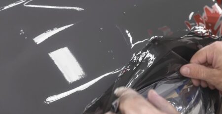
Choosing the Right Banner Pattern Materials
Selecting the right materials is vital for banner longevity and visual impact. Consider factors like weather resistance, print quality, and overall durability. For example, 10oz Mesh Banners are great for outdoor use. What material best suits your specific needs and budget?
Impact of Color Theory on Banner Patterns
Color theory plays a significant role in how your banner is perceived. Understanding color relationships, such as complementary and analogous colors, can enhance visual appeal. Using color effectively can draw attention and convey the right message. How will you use color to create the desired effect for your banner?
Crafting Visually Engaging Banner Patterns

Incorporating Brand Identity into Banner Patterns
Brand identity should always be at the forefront of your banner pattern design. A well-integrated brand identity creates instant recognition and reinforces your company’s message. Consider your logo, color palette, and overall brand aesthetic. How can you weave these elements seamlessly into your banner pattern to create a cohesive and memorable design? This approach helps build brand awareness and customer loyalty.
Utilizing Typography for Effective Banner Patterns
Typography plays a huge role in the effectiveness of your banner patterns. Choosing the right fonts and arranging them thoughtfully can make or break your design. Think about readability from a distance and the overall tone you want to convey. Are you using bold fonts to grab attention? Experiment with different font pairings and sizes to find what works best for your message. Effective typography ensures your message is clear and impactful.
Strategic Placement of Imagery in Banner Patterns
Strategic image placement can significantly enhance the visual appeal of your banner patterns. High-quality images that resonate with your target audience can draw the eye and communicate your message effectively. Consider the composition and balance of your design. Where are the focal points? How do the images interact with the text and other design elements? Thoughtful image placement creates a visually compelling and engaging banner pattern. For example, if you’re in Cerritos, consider using imagery that resonates with the local community when designing custom vinyl banners.
Advanced Techniques for Banner Pattern Creation
Exploring Geometric Banner Pattern Designs
Geometric banner patterns offer a structured and modern aesthetic. Using shapes like triangles, squares, and circles can create eye-catching designs. Consider how different geometric arrangements can convey different messages, from stability to dynamism. How can you use geometric patterns to add a contemporary edge to your banners?
Developing Organic Flow in Banner Patterns
Organic banner patterns mimic natural forms, creating a sense of movement and fluidity. Incorporating elements like curves, leaves, or water-like shapes can make your banners feel more inviting and less rigid. Experiment with different ways to achieve a natural look, such as using hand-drawn elements or flowing gradients. What natural elements can you incorporate to create a more engaging design?
Mastering Repetition and Rhythm in Banner Patterns
Repetition and rhythm are key to creating visually appealing banner patterns. Repeating elements can create a sense of unity and predictability, while varying the rhythm can add interest and excitement. Think about how you can use repetition to reinforce your message and rhythm to guide the viewer’s eye. How can you use repetition and rhythm to create a custom banner that is both visually appealing and effective?
Optimizing Banner Patterns for Different Platforms
Designing Banner Patterns for Digital Displays
Digital banner patterns need to grab attention fast. Consider animation and interactive elements to make your banners stand out in the crowded online space. How can you use motion graphics to draw the eye and increase click-through rates?
Think about responsive design for your digital banners. Your patterns should adapt seamlessly to various screen sizes, from smartphones to large desktop monitors. This ensures a consistent and engaging user experience, no matter the device. Are you testing your banner patterns on different devices to ensure optimal display?
Color palettes are crucial for digital displays. Bright, vibrant colors tend to work well, but always consider the overall aesthetic of the website or platform where the banner will be displayed. A well-chosen color scheme can significantly improve the effectiveness of your custom vinyl banners.
Adapting Banner Patterns for Print Media
Print banner patterns require a different approach than digital. Resolution is key; ensure your designs are high-resolution to avoid pixelation when printed. What resolution are you using for your print banner patterns?
Color accuracy is also vital for print media. Colors can appear different on screen than they do in print, so it’s important to use a CMYK color model and proof your designs before printing. This will help you achieve the desired look and feel for your printed banners. Have you calibrated your monitor to match your printer’s output?
Material choice impacts the final look of your banner. Different materials will affect the way colors appear and the overall durability of the banner. Consider the environment where the banner will be displayed and choose a material that is appropriate for the conditions. What material best suits your banner’s intended use?
Ensuring Scalability of Banner Patterns Across Sizes
Scalability is essential for banner patterns used in various formats. Vector graphics are ideal because they can be scaled up or down without losing quality. Are you using vector graphics for your banner patterns?
Maintain visual consistency across all sizes. While some elements may need to be adjusted for smaller formats, the overall design and branding should remain recognizable. This helps reinforce brand identity and ensures a cohesive look across all platforms. How can you simplify your design for smaller formats without sacrificing impact?
Consider the viewing distance for different banner sizes. Larger banners will be viewed from further away, so the design needs to be simple and easy to read. Smaller banners, on the other hand, can incorporate more detail. Have you tested your banner patterns at different viewing distances to ensure readability?
Common Pitfalls in Banner Pattern Design

Avoiding Overly Complex Banner Patterns
Overly complex banner patterns can overwhelm viewers and dilute your message. Simplicity is key to effective communication. Instead of cramming every idea into one banner, focus on a single, clear concept. This approach ensures your message is easily understood and remembered, leading to better engagement.
Preventing Visual Clutter in Banner Patterns
Visual clutter can make your banner pattern look messy and unprofessional. A clean design with plenty of white space helps guide the eye and highlights important elements. Consider reducing the number of elements, increasing spacing, and using a consistent visual hierarchy. How can you streamline your design to create a more impactful banner?
Addressing Readability Issues in Banner Patterns
Readability is crucial for conveying your message effectively. Poor font choices, low contrast, or small text sizes can make your banner difficult to read. Choose fonts that are clear and legible, ensure sufficient contrast between text and background, and use appropriate text sizes for the viewing distance. Are your banner patterns easily readable from a distance?
Tools and Resources for Banner Pattern Designers
Leveraging Design Software for Banner Patterns
Design software is now essential for creating banner patterns. Software like Adobe Illustrator and Photoshop offer powerful tools for vector design, image manipulation, and precise pattern creation. These programs allow designers to experiment with different layouts, colors, and effects, ensuring a professional and polished final product. What design software are you currently using, and how can it be optimized for banner pattern design?
Accessing High-Quality Stock for Banner Patterns
High-quality stock resources can significantly enhance banner pattern designs. Stock photo websites provide access to a vast library of images, textures, and graphics that can be incorporated into your designs. Using stock resources saves time and effort, allowing designers to focus on the overall composition and message. Consider exploring various stock resources to find the perfect elements for your next banner pattern project, and remember to check out our step and repeat backdrop banner options for your events.
Utilizing Online Communities for Banner Pattern Inspiration
Online communities are invaluable resources for banner pattern designers. Platforms like Behance, Dribbble, and Pinterest showcase a wide range of banner designs, offering inspiration and insights into current trends. Engaging with these communities allows designers to receive feedback, learn new techniques, and stay updated on the latest design innovations. How can you actively participate in online design communities to enhance your banner pattern skills and discover new ideas? Remember, if you’re in Cerritos, check out our custom vinyl banners for your business needs.
Participating in online communities can provide a wealth of knowledge and inspiration. Sharing your work and receiving feedback from other designers can help you improve your skills and stay up-to-date on the latest trends. It’s also a great way to network and connect with other professionals in the field.
Here are some ways to engage with online communities:
- Share your banner pattern designs and ask for feedback.
- Participate in design challenges and contests.
- Follow designers whose work you admire.
- Join relevant groups and forums.
Showcasing Successful Banner Pattern Examples
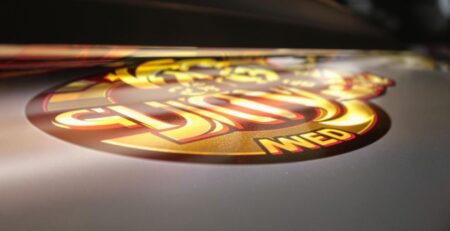
Analyzing Effective Commercial Banner Patterns
Commercial banner patterns are all around us, and understanding what makes them work is key. Effective commercial banners often use bold colors and clear messaging to grab attention quickly. By studying these examples, you can learn how to create banners that drive sales and build brand awareness. What elements make a commercial banner truly stand out and convert viewers into customers?
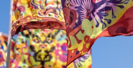
Deconstructing Event-Specific Banner Patterns
Event banners need to be eye-catching and informative, conveying the event’s theme and details at a glance. Consider the use of imagery, typography, and color palettes that resonate with the event’s target audience. Here are some key elements to consider:
- Clarity: Ensure the event name, date, and location are easily readable.
- Visual Appeal: Use graphics and colors that match the event’s theme.
- Call to Action: Include a clear message, such as "Register Now" or "Buy Tickets."
By deconstructing successful event banners, you can learn to create designs that effectively promote your own events. How can you adapt these strategies to create custom polyester fabric banners that perfectly capture the essence of your event?
Learning from Innovative Banner Pattern Campaigns
Innovative banner campaigns push the boundaries of traditional design, using unique patterns and creative concepts to capture attention. These campaigns often incorporate unexpected elements, such as interactive features or unconventional materials. Consider these points when analyzing innovative campaigns:
- Originality: What makes the design stand out from the crowd?
- Engagement: How does the banner capture and hold the viewer’s attention?
- Memorability: Will the banner leave a lasting impression?
By studying these campaigns, you can gain inspiration and insights into creating banner patterns that are both effective and memorable. What innovative approaches can you incorporate into your next banner design to make it truly unique?
Want to see more cool banner ideas? Check out our website! We have lots of examples to help you make the best choice for your needs. You can even order your own custom banner today.
Wrapping It Up: Your Banner, Your Way
So, we’ve gone over a bunch of stuff about making cool banners. It’s not just about throwing some words and pictures together. You gotta think about what you want it to do, who’s gonna see it, and where it’s going to be. Getting all those little details right can make a big difference. Don’t be afraid to try new things and see what works best for you. A good banner really gets people’s attention, and that’s what you want, right? Just keep practicing, and you’ll get the hang of it.
Frequently Asked Questions
What exactly is a banner pattern?
A banner pattern is like a special look or design you put on a banner. Think of it as the artistic style that makes your banner stand out. It includes the colors, pictures, and words you use to get your message across.
How can I make my banner pattern look good?
To make a banner pattern that really grabs attention, you should pick colors that look good together and use clear, easy-to-read words. Also, make sure any pictures you use are sharp and fit well with what you’re trying to say. Think about what will make people stop and look!
Should my banner pattern match my brand?
Yes, it’s super important! Your brand is what makes your business special. By using your company’s colors, logo, and special fonts in your banner pattern, people will easily know it’s you. It helps build trust and makes your brand memorable.
Is there a difference between designing for screens and for print?
When designing for screens, like on a website, make sure your images are clear even when they’re small. For printed banners, you need really high-quality pictures so they don’t look blurry when they’re big. It’s all about making sure your banner looks great no matter where it’s seen.
What are some common mistakes to avoid when making banner patterns?
A common mistake is trying to put too much stuff on one banner. This makes it hard to read and understand. Keep it simple and focus on one main idea. Also, make sure your words are big enough to see from far away.
What tools can help me create a banner pattern?
There are many computer programs like Adobe Photoshop or Canva that can help you design. You can also find lots of free pictures and ideas online. Don’t be afraid to look at what other successful banners are doing for inspiration!