Mastering the Facebook Event Banner Size for Optimal Engagement
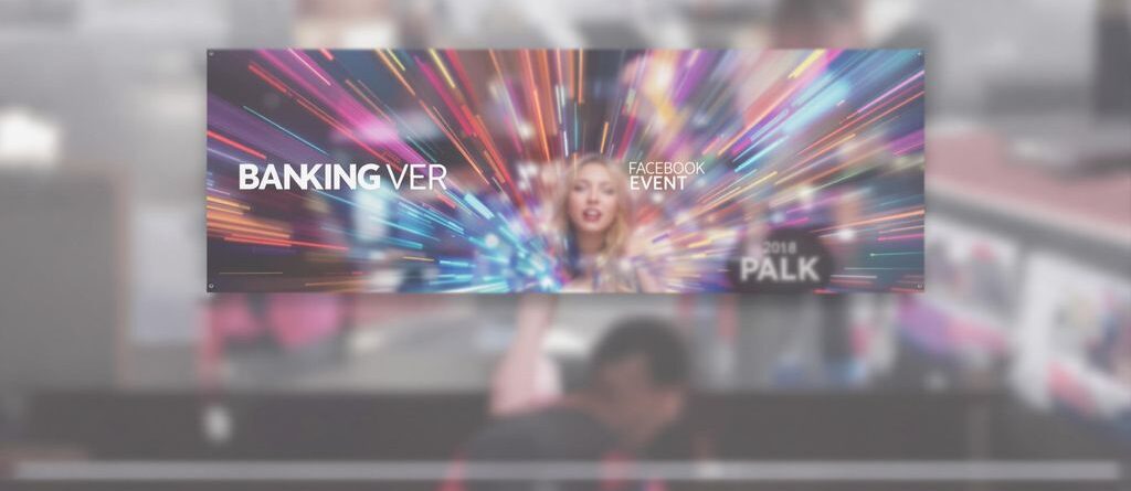
Getting your event noticed on Facebook can be tricky, but one of the easiest ways to grab attention is with a great banner. You want your event page to look good, right? Well, the size of your Facebook event banner really matters. If it’s too big, it gets cut off. Too small, and it looks blurry. So, figuring out the best facebook event banner size is a big deal for making sure your event looks professional and gets people interested. This guide will walk you through making a banner that actually works.
Key Takeaways
- Always go for the recommended facebook event banner size to avoid weird cropping.
- Make sure your main message and images are in the center so they show up on all devices.
- Test your banner on both computers and phones to see how it looks.
- Don’t put too much text on your banner; let the pictures do most of the talking.
- Use good quality images that are clear and look nice.
Understanding the Ideal Facebook Event Banner Size
Let’s talk about Facebook event banners. It’s easy to overlook, but getting the size right is super important. A blurry or cropped banner just doesn’t look professional, and it can actually hurt your event’s attendance. You want something that looks good on both phones and computers, right? So, let’s break down the specifics.
Optimal Dimensions for Event Cover Photos
The best size to aim for is 1920 x 1080 pixels. This gives you a nice, crisp image that scales well. Think of it like this: you’re setting the stage for your event. A good banner grabs attention and makes people want to learn more. If you use a smaller image, Facebook will stretch it, and it’ll look pixelated. Nobody wants that!
Aspect Ratio for Universal Display
The aspect ratio is just as important as the dimensions. You want a 16:9 aspect ratio. This ensures your banner looks good on different devices. If you use a different ratio, Facebook might crop your image in weird ways, cutting off important details. It’s like framing a photo – you want everything to fit nicely within the frame. For example, if you’re using a printer capable of high-resolution output, you’ll want to make sure your source image is also high-quality to avoid any loss of detail when resizing.
Ensuring Visual Appeal Across Devices
Here’s the thing: people will be viewing your event on all sorts of devices – phones, tablets, laptops, desktops. Your banner needs to look good on all of them. That means considering how it will scale down on smaller screens.
Here are a few things to keep in mind:
- Keep the important stuff in the center. This helps prevent key details from getting cropped out on smaller screens.
- Use high-resolution images. This ensures your banner looks sharp, even when scaled up.
- Preview your banner on different devices. This helps you catch any potential issues before they become a problem.
It’s worth taking the time to get your Facebook event banner right. A well-designed banner can make a big difference in how many people attend your event. It’s all about making a good first impression and giving people a reason to click that "Interested" or "Going" button.
Here’s a quick table summarizing the key info:
| Aspect | Dimension |
|---|---|
| Recommended Size | 1920 x 1080 pixels |
| Aspect Ratio | 16:9 |
Crafting Compelling Facebook Event Banners
Highlighting Key Event Information
When you’re putting together your Facebook event banner, think of it as a mini-billboard. The most important details need to jump out at people. Don’t make them hunt for the date, time, or location. Use clear, readable fonts and make sure the text contrasts well with the background. If it’s a concert, feature the band name prominently. If it’s a sale, shout out the discounts. People should be able to grasp the essentials at a glance.
Incorporating Brand Identity
Your event banner is a chance to reinforce your brand. Use your brand colors, logo, and overall style to create a cohesive look. This is especially important if you’re a business or organization. It helps people instantly recognize your event and associate it with your brand. Think of it as an extension of your website or other marketing materials. If you’re designing a banner for a local music festival, use imagery and colors that reflect the festival’s vibe and target audience.
Testing Banner Performance
Don’t just set it and forget it! Once your banner is live, keep an eye on how it’s performing. Facebook provides insights into how many people are seeing your event and interacting with it. If you’re not getting the engagement you want, try tweaking your banner. Maybe the image isn’t eye-catching enough, or the text is too small. Experiment with different versions and see what works best. A/B testing can be really helpful here. Try different images or headlines and see which one drives more clicks. It’s all about finding what resonates with your audience. You can use a Facebook Automation tool to help with this.
It’s a good idea to ask a few friends or colleagues for their honest feedback on your banner before you launch your event. Fresh eyes can often spot things you might have missed, like a distracting background element or a font that’s hard to read. Their input can help you refine your design and make it even more effective.
Here’s a simple table to illustrate A/B testing:
| Banner Version | Headline | Click-Through Rate |
|---|---|---|
| A | Early Bird Tickets Available! | 2.5% |
| B | Get Your Tickets Now & Save! | 4.1% |
Based on this, version B is the clear winner!
Designing for Maximum Visibility and Engagement
Centering Focal Points for All Screens
When designing your Facebook event banner, it’s super important to think about how it will look on different devices. The key is to center your focal point. This way, whether someone is viewing the event on a desktop or a phone, the most important part of the image is always visible. It’s a simple trick, but it makes a big difference.
Strategic Text Placement on Banners
Where you put text on your banner matters a lot. Don’t just slap it anywhere! Think about readability and visibility. Here’s a few things to keep in mind:
- Keep text away from the edges. Some devices might crop the image, cutting off your words.
- Use contrasting colors. Make sure your text stands out against the background.
- Keep it short and sweet. No one wants to read a novel on a banner.
A good rule of thumb is to keep the most important text in the center of the banner. This ensures it’s visible no matter what device someone is using. Also, consider adding a subtle background behind the text to make it even easier to read.
Utilizing High-Quality Imagery
Using good images is a no-brainer, but it’s worth repeating. Blurry or pixelated images make your event look unprofessional. Here’s a quick guide:
- Use high-resolution images. Aim for at least 1920×1080 pixels.
- Choose images that are relevant to your event. Don’t just pick something random.
- Make sure the image is well-lit and visually appealing. Nobody wants to look at a dark, gloomy picture.
Using high-quality images is a simple way to make your event look more appealing and attract more attendees. If you need printed adhesive vinyl for your event, make sure it’s top-notch too!
Optimizing Your Facebook Event Banner for Mobile

Adapting to Smaller Screen Formats
Mobile is where most people will see your Facebook event, so it’s super important to make sure your banner looks great there. Think about how the image will scale down. A banner that looks awesome on a desktop might become a blurry mess on a phone. Consider using simpler designs with less detail to ensure clarity on smaller screens. You might even want to experiment with different aspect ratios that are more mobile-friendly, like vertical or square formats.
Previewing on Various Mobile Devices
Never assume your banner looks good on all phones just because it looks good on yours. Different phones have different screen sizes and resolutions. Always preview your banner on as many different mobile devices as possible. Ask friends or colleagues to check it out on their phones too. This helps you catch any weird cropping or resolution issues before your event goes live. It’s a small step that can make a big difference. You can also use Facebook’s preview tools, but seeing it on actual devices is always better. This ensures your event page looks professional.
Considering Vertical and Square Formats
While the standard 16:9 aspect ratio works well on desktops, it might not be the best choice for mobile. Vertical or square formats can often be more engaging in mobile feeds because they take up more screen space. Here’s a quick comparison:
| Format | Aspect Ratio | Mobile Visibility | Considerations |
|---|---|---|---|
| Standard | 16:9 | Good | Works well if designed with mobile in mind. |
| Vertical | 4:5 | Better | Takes up more screen space, more eye-catching. |
| Square | 1:1 | Good | Clean and simple, works well for branding. |
When designing for mobile, remember that less is often more. A clean, simple design with a clear focal point will always perform better than a cluttered one. Make sure your text is large enough to read on a small screen, and avoid using too many colors or distracting elements.
Here are some tips to keep in mind:
- Keep key information centered to avoid cropping.
- Use high-resolution images that scale down well.
- Test your banner on multiple devices before publishing.
Leveraging the Facebook Event Banner for Branding
Integrating Logos and Brand Colors
Think of your Facebook event banner as prime real estate for your brand. It’s a chance to make a visual statement. Subtly incorporating your logo and brand colors can significantly boost brand recognition. Don’t go overboard, though. A banner plastered with logos can look unprofessional. Instead, aim for a balanced design where your branding complements the event’s theme.
Establishing Professional Image
A well-designed event banner speaks volumes about your organization. It communicates professionalism and attention to detail. A blurry, pixelated, or poorly designed banner can give the impression that the event is disorganized or low-quality. Invest time in creating a banner that reflects your brand’s values and the event’s purpose. This is your chance to make a good first impression.
Creating Recognizable Event Visuals
Consistency is key when it comes to branding. If you’re hosting a series of events, consider developing a template or style guide for your banners. This will help create a cohesive look and feel across all your events, making them instantly recognizable to your audience. Think about using recurring design elements, color schemes, or fonts to optimize Facebook event cover photo size and build brand awareness.
A consistent visual identity across your Facebook events helps attendees quickly identify and associate the event with your brand. This builds trust and familiarity, encouraging higher engagement and attendance.
Here are some ways to maintain visual consistency:
- Use the same logo placement on all banners.
- Stick to a limited color palette that aligns with your brand.
- Choose a font family and use it consistently across all text elements.
Advanced Tips for Facebook Event Banner Success
Experimenting with Different Image Types
Don’t just stick to photos! Try using illustrations, graphics, or even short video loops as your Facebook event banner. See what resonates best with your audience. A/B testing different image types can give you solid data on what works. For example, a music event might benefit from a dynamic video loop showcasing past performances, while a conference could use a clean graphic highlighting speakers and key topics. It’s all about finding the right fit.
Minimizing Text for Visual Impact
Less is often more when it comes to text on your banner. People are scrolling quickly, so you need to grab their attention fast. Instead of cramming every detail onto the image, focus on the most important information – event name, date, and maybe a short, catchy tagline. Use the event description for everything else. Think of the banner as a billboard, not a brochure.
Adapting to Facebook’s Algorithm Changes
Facebook’s algorithm is constantly evolving, and that can affect how your event banner is displayed and how much reach it gets. Stay up-to-date on the latest changes and adjust your strategy accordingly. What worked last year might not work today. Pay attention to engagement metrics and be prepared to tweak your event cover photo based on performance.
Keep an eye on Facebook’s official announcements and industry blogs to stay informed about algorithm updates. Small changes in the algorithm can have a big impact on the visibility of your event, so it’s important to be proactive.
Here’s a simple table showing how different text densities might affect engagement:
| Text Density | Click-Through Rate | Engagement Rate |
|---|---|---|
| Low | 4.5% | 2.1% |
| Medium | 3.8% | 1.8% |
| High | 2.9% | 1.5% |
Consider these points when designing your next banner:
- Keep text concise and readable.
- Use high-quality images.
- Test different designs to see what performs best.
Ensuring Your Facebook Event Banner Stands Out

Adhering to Recommended Facebook Event Banner Size
Using the right size for your Facebook event banner is super important. Facebook suggests using 1920 x 1080 pixels, with a 16:9 aspect ratio. If you don’t, your banner might look stretched or blurry, which isn’t a good look. Think of it like wearing clothes that don’t fit – it just doesn’t work. Sticking to the recommended Facebook event banner size helps make sure everything looks professional and polished.
Creating a Simplistic Yet Effective Design
Don’t overdo it! A clean and simple design often works best. Here’s why:
- Too much text can be overwhelming.
- Cluttered graphics can distract from your message.
- A simple design is easier to understand at a glance.
Think of your banner as a billboard. You only have a few seconds to grab someone’s attention. Make it count with a clear, concise, and visually appealing design.
Driving Engagement Through Visuals
Visuals are key to getting people interested in your event. Use high-quality images that are relevant to your event’s theme. Think about what kind of feeling you want to create and choose images that match that. Here’s a quick guide:
- High-Quality Images: Avoid blurry or pixelated photos.
- Relevant Imagery: Make sure the images relate to your event.
- Eye-Catching Design: Use colors and layouts that grab attention.
Want your Facebook event banner to really pop? Make it super eye-catching so everyone notices! A great banner can make your event a huge hit. Check out our website to learn how to make your banner the best it can be!
Conclusion
So, we’ve talked a lot about getting your Facebook event banner just right. It really does make a difference, you know? Like, if your picture looks good and fits perfectly, people are way more likely to stop scrolling and actually check out what you’re doing. It’s not just about picking a random photo; it’s about making sure it looks sharp on phones and computers, and that all your important info is easy to see. Get that banner dialed in, and you’re already a step ahead in getting folks excited about your event.
Frequently Asked Questions
What’s the best size for a Facebook event banner?
For the best look, your Facebook event banner should be 1920 pixels wide by 1005 pixels tall. This size makes sure your image looks great on both computers and phones.
What’s the ideal shape (aspect ratio) for the banner?
An aspect ratio of 16:9 is perfect. This means the picture is wider than it is tall, which works well across different devices without getting cut off weirdly.
Does the banner size really matter for my event?
Yes, it’s super important! A banner that’s the right size looks professional and grabs people’s attention. If it’s too big or too small, it might look blurry or cut off, which isn’t good for your event’s image.
How can I make sure my banner looks good on all devices?
Make sure your most important info, like the event name or date, is in the middle of the picture. Facebook sometimes crops banners differently on phones versus computers, so keeping key details centered helps everyone see them.
Should I use high-quality images and my brand’s colors?
Absolutely! Use bright, clear pictures that fit your event. Also, try to include your brand’s colors and logo in a subtle way so people know right away who’s hosting the event.
How can I test my banner before it goes live?
Always check how your banner looks on both a computer and a phone before you make it final. This way, you can catch any problems and fix them to make sure your banner looks perfect everywhere.

